Client
NTU
NTU
User Experience (UX)
UI Design
Wireframing
Front-end Development
WordPress Integration
Corporate Identity
Brand Guidelines
Brochure
PowerPoint Deck
WordPress Website
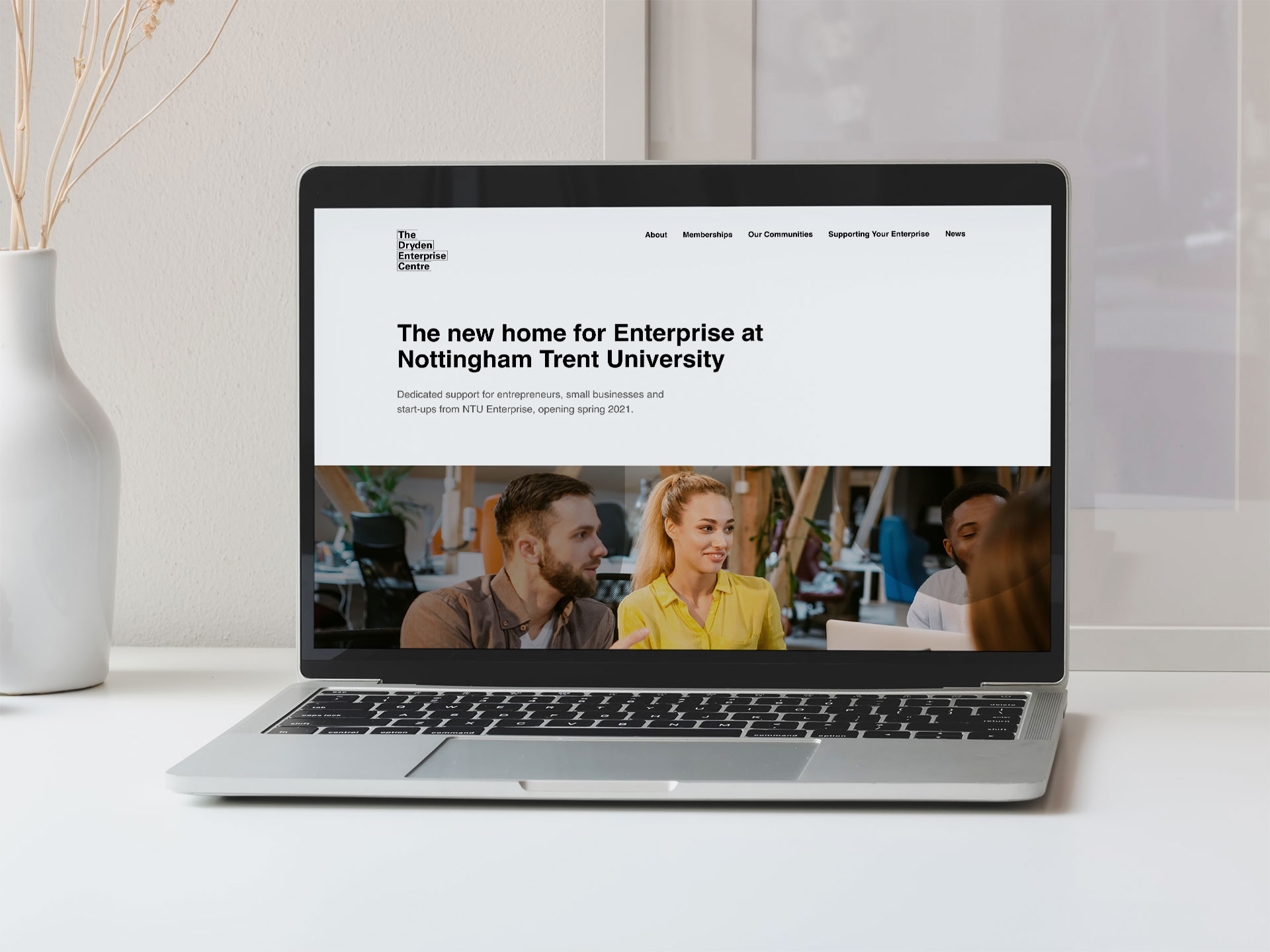
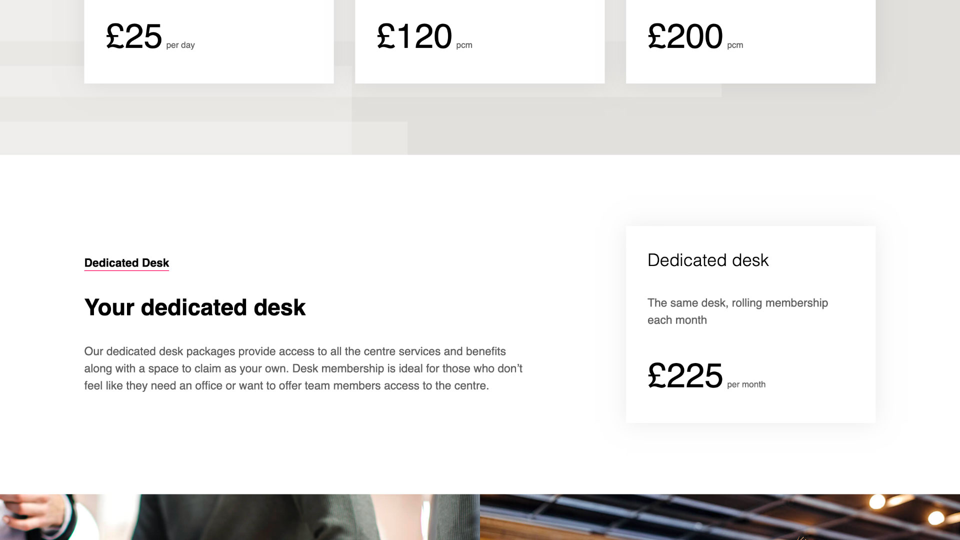
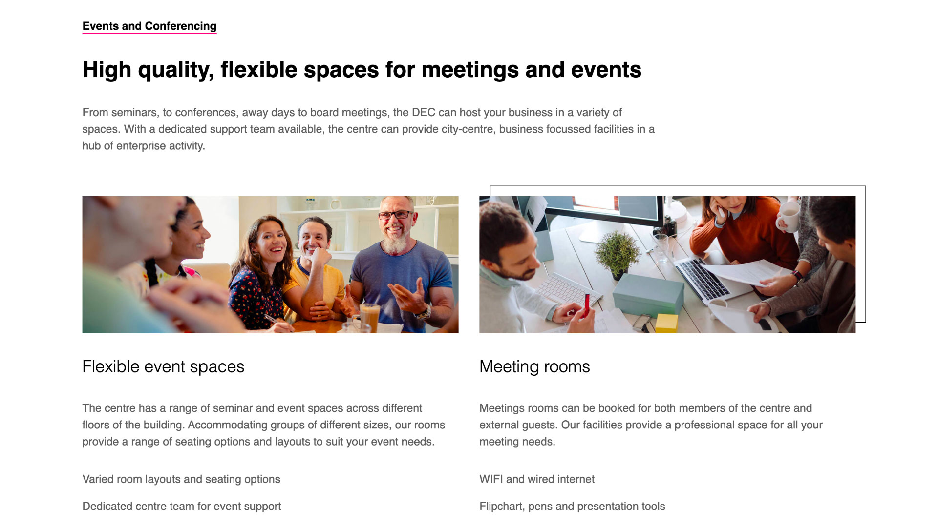
As NTU opens the door of its state of the art enterprise centre within Nottingham city centre, the requirements for branding and marketing material to speak to and engage with its audience of entrepreneurs, small businesses and start-ups become more apparent. Affari were tasked with just that, creating a clean brand that encompassed the values of the centre, developing a website that explained further the benefits the centre can provide and its various packages for hot-desking, static desks and virtual tenant options.
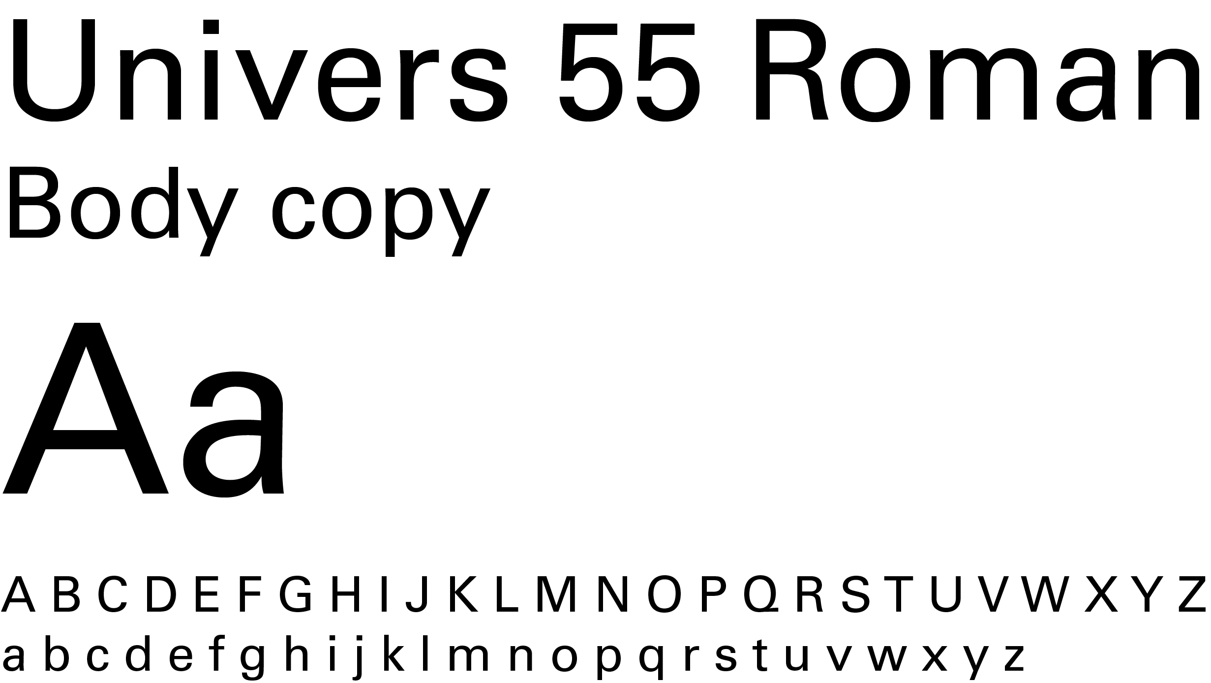
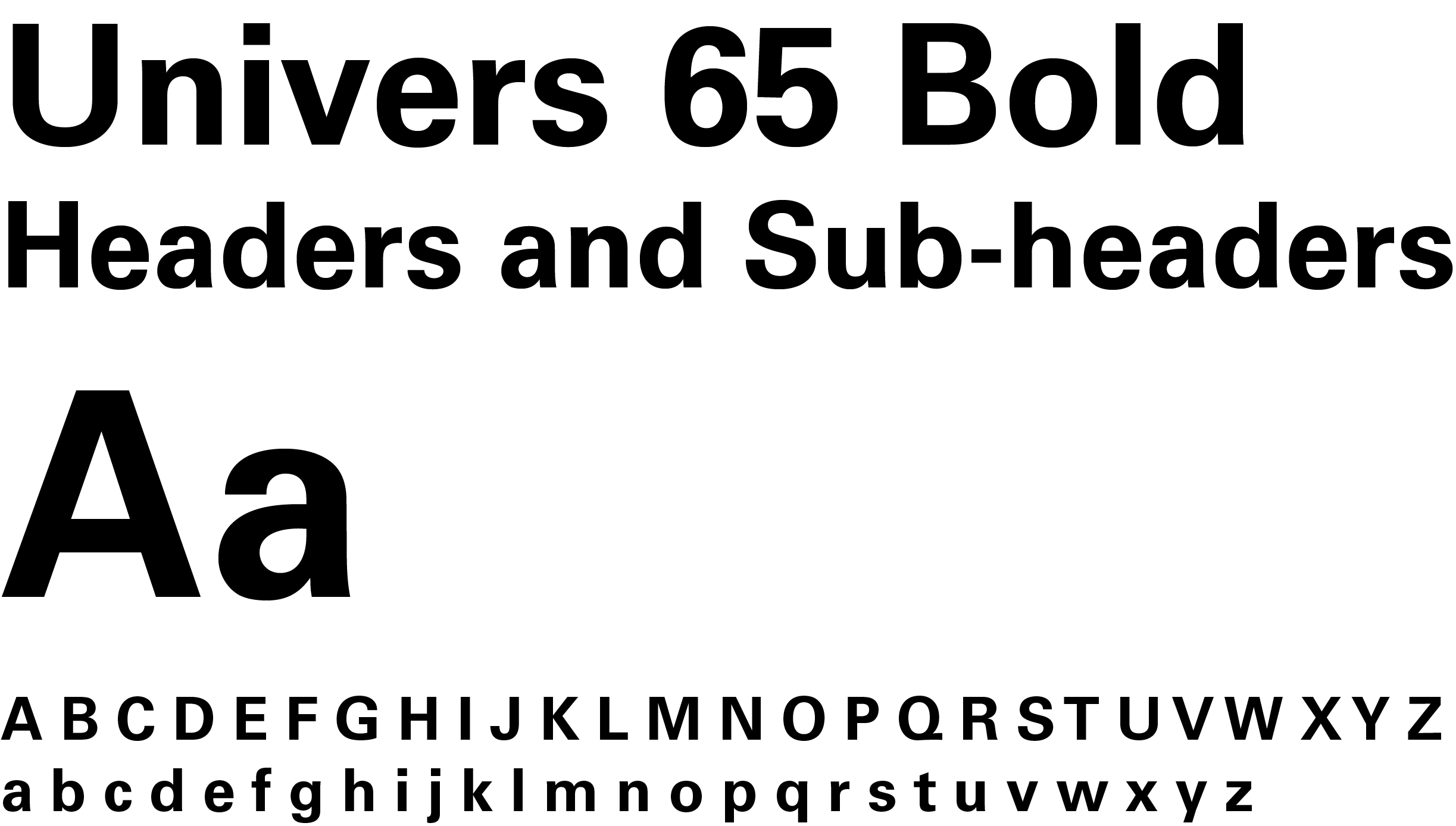
Process: Identity design, colour theory, typography, layout
In line with NTU’s new branding, we created a coherent visual identity for the Dryden Enterprise Centre which feels both connected and branched out from the overall NTU visual language. This directly supports and underpins the concept of the DEC, allowing audiences to recognise the link.
We designed a logo that is contemporary and timeless, this then proceeded to inform further visual elements such as the use of the shape defined around the logo for graphical overlays. This ties the visual identity together seamlessly whilst adding subtle yet exciting interest to designs. This graphical overlay can be used as a design element to enhance any brand asset from brochures to window motifs.
The imagery was carefully selected to embody the essence of the Dryden Enterprise Centre and features a wide range of diversity. This was then treated to achieve rich and bold tones with depth, giving consistency throughout. For feature images, the NTU shield is utilised as an overlay and enlarged for an abstract and modern result.
Iconography was created to support the messaging and shown in a classic clean style with fine broken strokes providing a refreshed approach. Other design elements include offset stroke lines to enhance imagery and content, large blocks of colour and powerful layouts.
Hexcode
#000000
Hexcode
#5d5d5d
Hexcode
#6f6258
Hexcode
#e2e0de
Hexcode
#e6005b
Hexcode
#ffffff



Process: UI/UX
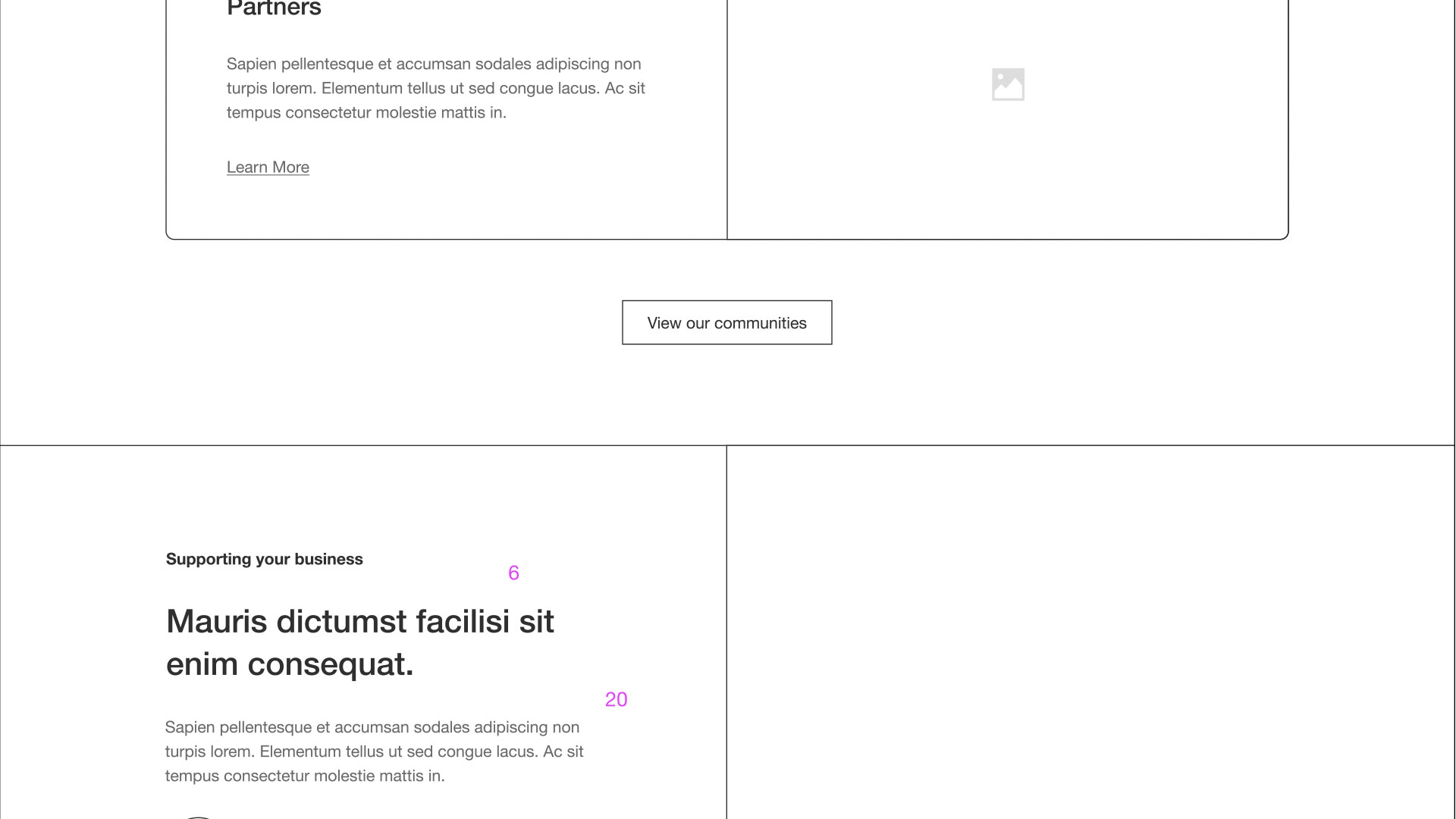
Wireframing is a crucial part of the web design and development lifecycle which allows for quick iterations of a site’s layout and structure. As DEC was a greenfield project, this process was more important than ever, allowing us to quickly present our ideas to the client.
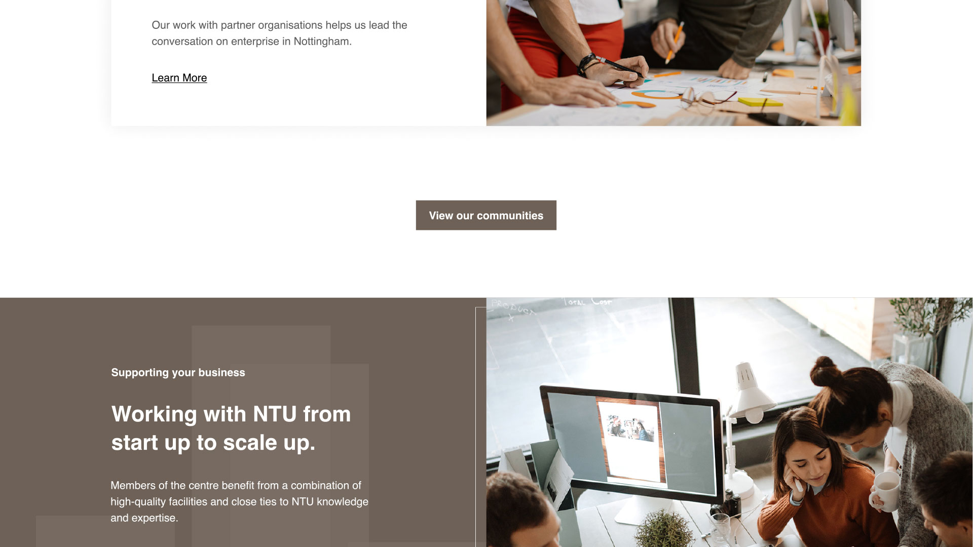
Once the client was happy with the layout of the site, we moved on to applying a design layer over the top. This involved taking inspiration from the brand guidelines and translating them into a format that was suitable for components used across the site. The result was a contemporary aesthetic that utilised the muted earthy tones from the colour palette, whilst using the ‘NTU pink’ to draw attention to important elements and CTAs. We also used geometric shapes and background images to add a further aesthetic to the design of the site.
Process: Coding, CMS integration and deployment.
Following sign-off of the design, we then began to translate the visual into a mobile-first, responsive website by writing clean, functional and reusable front-end code. This was all done inside a bespoke development environment utilising the latest front-end development technologies. Initially, we produced a static iteration of the site to quickly allow the user to understand how it will behave before resources were spent on the CMS integration.
The client had requested that WordPress would be used as a back-end to manage the content across the site. We also ensured that the site followed accessibility guidelines (specifically WCAG2.1 compliance) and implemented Google Tag Manager, allowing the client to track user trends and behaviours across the site.

We bring a personal and effective approach to every project we work on.
Start a project
This website uses cookies so that we can provide you with the best user experience possible. Cookie information is stored in your browser and performs functions such as recognising you when you return to our website and helping our team to understand which sections of the website you find most interesting and useful.
This website uses Google Analytics to collect anonymous information such as the number of visitors to the site, and the most popular pages.
Keeping this cookie enabled helps us to improve our website.
Please enable Strictly Necessary Cookies first so that we can save your preferences!

