Client
Microsoft
Microsoft
Concept Development
Typography
Colour Scheme
Production
Post-production
6 Digital Brochures
We created a series of 6 digital brochures to showcase Microsoft’s capabilities and partners within the education sector. We designed the brochure to include multiple engagement touch points, including call to actions for product information, insightful videos and even a virtual classroom.
Hexcode
#737373
Hexcode
#00A4EF
Hexcode
#7FBA00
Hexcode
#FFB900
Hexcode
#F25022
Hexcode
#ffffff
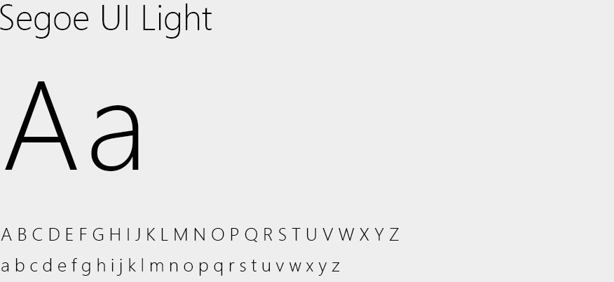
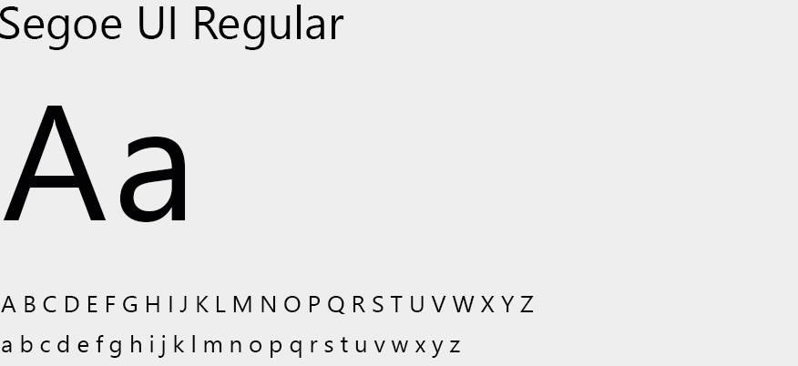
A B C D E F G H I J K L M N O P Q R S T U V W X Y Z
a b c d e f g h i j k l m n o p q r s t u v w x y z
Process: Concept development, image sourcing, typography and colour scheme.
Once the content and messaging had been supplied to us, we selected imagery that was in-keeping and relevant to the target audience. Whilst sourcing imagery, we were conscious to ensure that it was reflective of today’s modern classroom, as well as visualising students working in alternative environments, in order to embody the vision of Microsoft’s ‘Anytime, Anywhere learning’ offering.

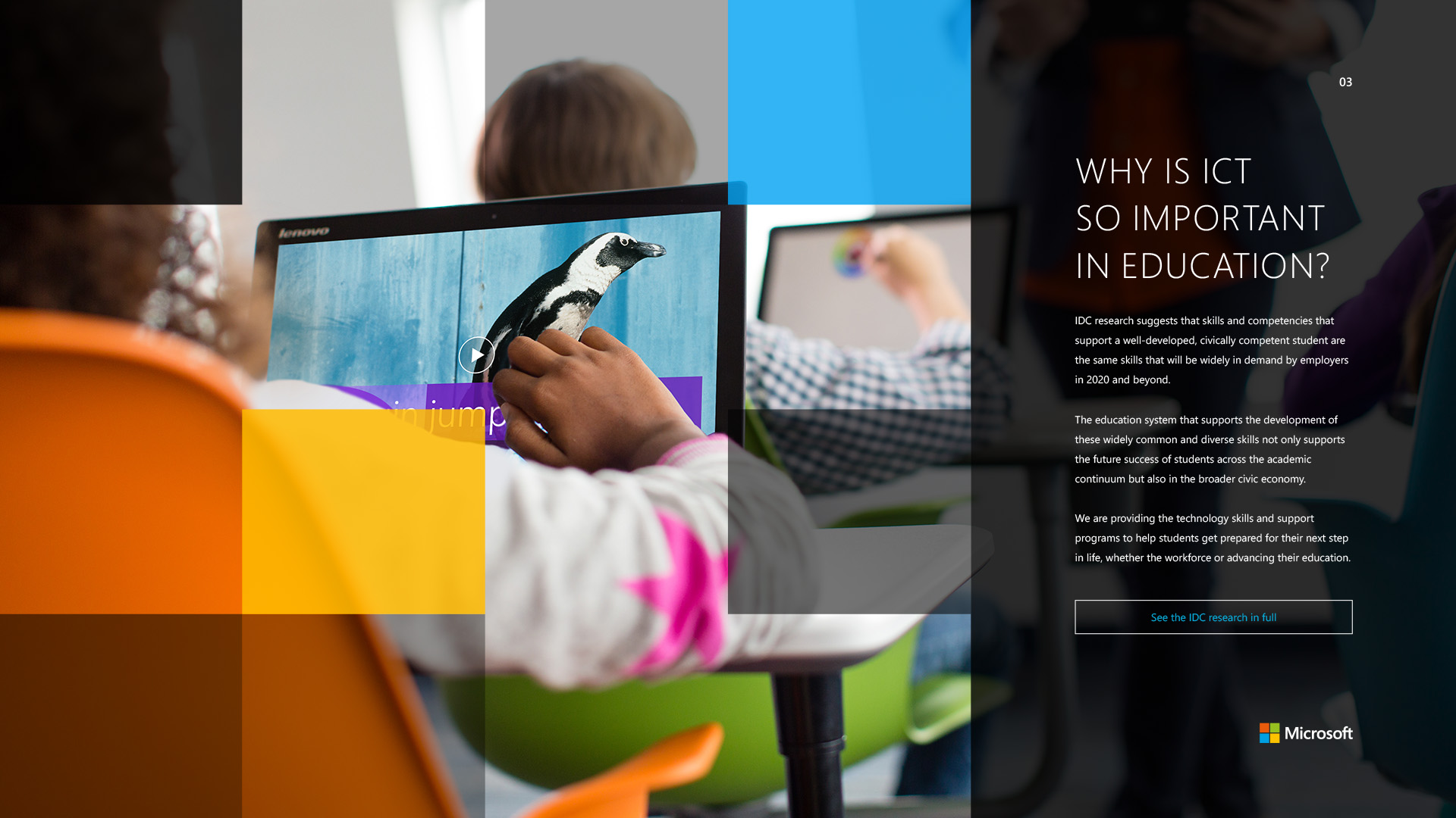
Process: Layout, design and imagery.
We wanted to ensure the continuity of Microsoft’s brand identity throughout the entirety of the brochure, so we introduced the square overlays over visuals to keep a consistent and coherent theme, tying all the content together. It was integral to ensure a smooth user journey that was intuitive to Microsoft’s target audience. We embedded relevant imagery to accompany and highlight relating content and added links and videos to create further engagement.
Process: Editing, compositing and colour grading.
Process: Editing, compositing and colour grading.


We bring a personal and effective approach to every project we work on.

This website uses cookies so that we can provide you with the best user experience possible. Cookie information is stored in your browser and performs functions such as recognising you when you return to our website and helping our team to understand which sections of the website you find most interesting and useful.
This website uses Google Analytics to collect anonymous information such as the number of visitors to the site, and the most popular pages.
Keeping this cookie enabled helps us to improve our website.
Please enable Strictly Necessary Cookies first so that we can save your preferences!

